Over the last couple of days I was supposedly going to work on some mood boards for the master bedroom and another guest room. Well, I got focused on the kitchen instead. I'm not sure what got into me, but I felt like I wanted to shoot a few ideas at it.
The color for the kitchen has actually been a bit of a thorn in my side. It is a pretty neutrally colored kitchen, but for some reason I'm just not falling in love with anything I try to pair up with it.
I've spent many hours thinking about the kitchen and what exactly I want to do with it. I could stay very monochromatic and do varying shades of gray and beige, but that's just really not me. Blue and brown would probably be the best color combination, but seeing as I'm not as big of a fan of that color combo as I used to be, I'm leaning away from it. It just seems too safe. Therein lies the dilemma of which color I should go with.
So, the other day I took a picture of the kitchen and threw it into Photoshop to play around with a few different colors, fabrics, etc., and I came up with a combination that was starting to speak to me. I'm pretty hooked on greens right now and found a fabric I was salivating over.
I threw the fabric in as a shade, made a few other alterations, and this is where I ended up.
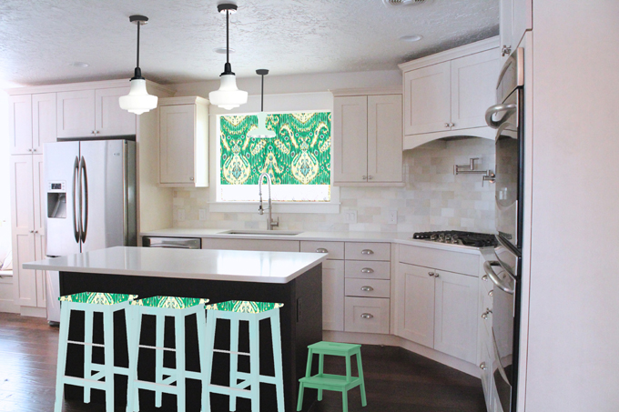
I thought, finally a scheme I really really like! At this point I felt like I was really onto something, so I sent it off to my husband to get his opinions on the matter.
DISASTER! He HATED it! Not just disliked it, or had unsure feelings about it, but literally hated it. He said the curtains looked like they were on drugs and the colors were too bright. I tried to explain that in Photoshop the colors would look unusually bright, that it was meant as just an idea of what things will look like, not what they will actually look like. To no avail, he still turned his nose up at it. Apparently he doesn't like any Ikat fabric at all. You can imagine my dismay upon discovering this news (especially since I'd bought some that day for our bedroom and I'm kind of in love with Ikat right now). What's a girl to do? We are two lovers in a battle of wills.
The rest of the day I sent him photos of numerous types of Ikat fabric, hoping that one would strike his interest. Nope, my hope was a false hope.
Now we are in debate as to what we should do in the kitchen. He says maybe he just needs to see it in person. So, do I decorate a whole kitchen in the hopes he will like it? Or, continue on, hoping to find a fabric/look comparable to this one, that he will like and me sort of like?
What are your thoughts? What color/style would you do?
Linked With:
Tags
- Facebook Like
- Google Plus One

- Log in to post comments

Comments
I do like the seafoam green. I'm not sure I love your fabric, but it may be like you said that the photoshop makes it look too bright. I could see yellow in your kitchen. Or what if you put a blue, yellow or tourquoise tone with the seafoam? But decorating is not my strength, as you know. Call Jen.